
Renting a car couldn't be easier
'FastLane' Mobile App

What is FastLane?
FastLane is a UX/UI Design case study on car rental booking applications, completed as a component of my educational program at the UX Design Insititute in 2023.
The goal was to create a product that can compete with existing competitors on the market, that is more user-friendly, improving the car rental booking experience.
Role
UX/UI Designer
Team
Solo Project
Time
Tools
10 weeks
Adobe Suite, Zoom, Miro, Figma, LetsView
Research
What's out there currently?
I have never rented a car before in my life. As a result, I had never had a need to download an application to compare rental prices of cars amongst differing competitors. Going into this project "blind" allowed me to approach this market with fresh unbiased eyes.
Beginning my research with competitive benchmarking was extremely useful, as it allowed me user-test these apps to identify their strengths and weaknesses.
I reviewed five key pages:
-
Landing screen
-
Search engine
-
Item selection
-
Add-ons
-
Payment Details
The selected competitors:
-
Sixt
- Avis

Competitive benchmarking key takeaways
1. Prioritising screen content is critical, determining default visibility, interactive details, and excluding non-essential information.
2. A clear sequence of tasks from start to finish, following the industry norm, which users would expect to follow when booking a rental car.
3. Avoid industry jargon, or where required, provide accessible information for the user to understand complicated terms.
4. Clarity through informative screen headings, informs users effectively as to what the purpose is for that screen and what may be expected of them.
5. Software is forthcoming with information, that users can quickly understand if a car is unavailable for a certain date before proceeding, for example.
But how are users finding the experience?
When it came to usability testing I approached two people I thought would be perfect candidates; one who travels frequently for business purposes and thus requires a rental car each trip (the 'expert'), and the other who would infrequently book a car when travelling abroad for recreational purposes. I selected two booking platforms for each user to test; SIXT and Europcar.

Usability test conducted with "expert" user

Usability test conducted with "casual" user
Key insights gained from user testing
1. Users require an easy-to-read UI with clear navigation.
2. The booking process needs to be simplified, where options are selected through easy-to-use toggles and buttons.
3. Software needs to be forthcoming with information, for example, when a user uses the filter function to search for a specific vehicle type and there's an error with the search but no reason provided.
4. It was noted that users responded highly to transparency of payment early in the booking process, and having the choice of multiple payment options to choose what's best for them.
5. Users found it incredibly helpful to have clear images of vehicle options provided as they wouldn't be aware of what some vehicles were by their name alone.
6. Information needs to be clearer for users. All booking platforms tested used industry jargon which users, other than the "expert" user, weren't very familiar with such as "CDW with excess" (Collision Damage Waiver).
7. A simple colour palette is much clearer. Users could identify icons much easier and text was much more legible.
It's time for us

a closer look
to take
Analysis


Though the process took some time to create our whiteboard of information, from organising the individual notes of data into logical groupings to then creating even higher orders of compositions, the data output below allowed me to finally structure the qualitative research data into something substantial.
With the research insights collated, it was time to sift through the data. With the assistance of a couple colleagues, we grouped all of the research data into logical groupings to make sense of the qualitative data. With some structure to the information, this affinity diagram would bring incredibly rich observations.


Some real concrete data

In total, there was 186 notes made. The breakdown is as follows:
Postive experience x109 (58.6%)
Experience could be improved x20 (10.8%)
Negative experience x57 (30.6%)

58.6%
The user experience booking a rental car is mainly a positive one
61%
The average postive experience throughout the booking process
The areas which provided the most feedback were:
-
Search results
-
x47 notes
-
x22 positive
-
x3 experience could be improved
-
x22 negative
-
-
-
Location selection
-
x35 notes
-
x21 positive
-
x3 experience could be improved
-
x11 negative
-
-
The area that worked best throughout the booking process was the payment/user details screens, with a positive feedback result of 93%, and no negative feedback.
These screens were certainly the most simple and straightforward for the users to navigate, and little time was spent on them.

Areas with greater than average postive experiences are:
-
Landing page (62.5% positive)
-
Location selection (61.1% positive)
-
Date and time selection (66.6% positive)
-
Filter function (70.0% positive)
-
Payment / User Information (93.3% positive)
The worst area of the booking process with greater negative than positive results is:
-
Insurance / Coverage (46.2% negative)
This was primarily related to users being unsure as to the differences between varying coverage packages and the coverage that was provided. Considering that one of the major concerns for users was potential damage being caused to the car being discovered on the return of the vehicle, this is a critical area that requires improvement.
The most divided areas of the booking process with similar positive to negative results are:
-
Search results (46.8% positive / 46.8% negative)
-
There were many aspects which worked (lots of information and icons displayed clearly on screen, images of vehicles for user to view) but there were equally as many problematic issues the user experiences (mainly relating to the UI of the screen, legibility difficulties, back-end errors which stalled the users' flow).
-
-
Vehicle selection (50.0% positive / 41.7% negative)
-
What worked was the simplicity of the screen, with main information of the car selected and price displayed clearly. However, the users typically missed where they could see "more information".
-
Mapping out the journey
Based on the discoveries made from the previous affinity diagram, I proceeded with creating a customer journey map. This overview of the user's path through an app while they booked a rental car allowed me to highlight their goals, behaviour, pain points and mental models for each step of the process.

Key observations from the customer journey map
Analyzing the above research data uncovered a lot of pain points and areas for improvement. The following observations were deduced:
1. Users mostly struggled with insurance and coverage.
This was also observed from the affinity diagram previously made. It's clear that this is an area that requires development. Users were unsure what various coverage packages actually provided, and were often provided with long lists of T&Cs to find out what their insurance policy would be. A lot of this stemmed from platforms using industry jargon such as "CDW with excess", which users didn't understand.
2. Search results and vehicle selection screens could be improved. Although not as problematic as the insurance screens, these are areas that are critical to the booking process. The main issue with both of these areas was that there was a large amount of information displayed at once, which reduced legibility and led to users missing key information or features.
3. Payment selection and user details were highly positive.
Users were familiar with personal information and payment pages, and found it clear and easy to proceed with the final step of the booking process. Additionally, users responded highly to having multiple payment options available (pay at counter or pay online).
"I do like the interaction with a person so if I have any questions,
I can ask ... I feel more reassured."
With my research and analysis now complete, it was finally time to start with...
Design
Finding the right flow
Starting the design process, my overall objective was to fix the issues uncovered from my research. I began with defining a high-level flow for the mobile app that I would be creating, to ensure that I could understand how users would flow through the design.


This was the first step in creating the solution and ensuring that the final design would make sense, and allow users to easily navigate through the app. The overall main goal was to streamline the user experience and establish a journey through the mobile app that was straightforward and logical.
Drawing the way forward
To further develop the user's flow required sketching out the interaction design in detail. Coming from a background in architecture, this was one of my favourite steps of the design process. Like iterating on a sketch design for building, I compiled a list of screens to be designed, using the flow diagram I had previously created as a template.
With my drawing pad out, a ruler and some pens, I went about designing each screen throughout the journey of the user. Attention was given to capturing distinct screen states, especially when variations were significant due to direct actions by the user.

Building the foundations
With my sketch scheme in hand, I began with building the mid-fidelity prototype. Using Figma for the first time was quite a learning experience, but after a week of late night shifts, it was beginning to come together.
The wireframes I had produced were invaluable to follow as a base plate, and with the insights gained from my research and analysis, I was able to translate these insights into a functioning prototype.

Try for yourself!
Note
To flow through the prototype application on the right, please note the following inputs are required to successfully make a booking:
-
Pick-up and return location is London Gatwick Airport.
-
Pick-up date is 14th August at 08:00am.
-
Return date is 21st August at 11:30am.
-
Selected vehicle will be VW Polo, with manual transmission.
-
An additional driver will be required.
What was achieved?
There were a number of issues I had identified through the research data I had gathered, which I hoped my design remedied.

Readability
It was noted during user testing that reduced legibility and key functions were bring missed by users as a result of screen clutter, especially on screens with large amount of information displayed eg. choosing a vehicle. The apporach to the design was to take a minimalist attitude, only showing key items on screen, using clear iconography to reduce large blocks of text, and simple colours to highlight areas of importance, such as price.
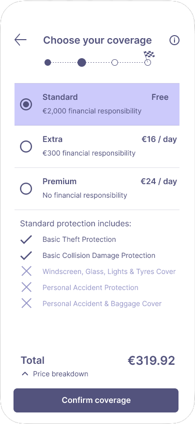
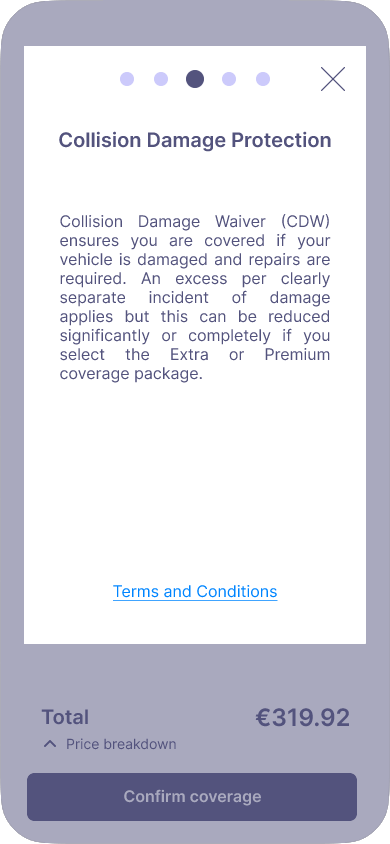
Insurance
My research and analysis consistently highlighted that users were struggling with understanding insurance/coverage options. The information regarding what types of coverage packages they could select from was unclear as apps often used technical industry jargon which users could not understand. This was an unavoidable area of the booking process, so I clearly divided the various packages and indicated what is applied for each available selection. A clear information icon at the top of the screen, once tapped, opens an overlay which explains the insurance terms in further detail for the user.
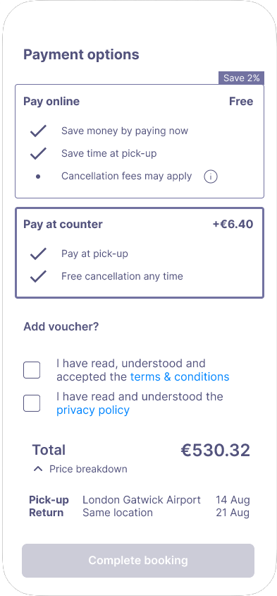

Payment
User testing also displayed that transparency of payment was of critical importance. It was a massive red flag for users to find hidden fees applied at the end of the booking process, resulting in user frustration. Payment transparency is a strong priority in my design. Users are given access to a payment breakdown throughout the process. Additionally, multiple payment options are provided; paying online or in-person, and the differences in cost between each option.
Blueprints for developers
The final piece of work completed for this case study was creating an annotated document which could be handed over to developers to build the application. The annotations included information such as: rules, interactions, feedback, navigation, components, and more.

Conclusion
Now that it's done, what did I learn?
... and what would I have done differently?
This was the first UX design project I had completed, and it was a massive learning experience throughout. I truly learned the importance of research and analysis when it came to sitting down and starting the design process. Without the information that I had gathered over a number of weeks, my design wouldn't have had the structure that it required to create something succesful.
Coming from my background in architecture, I knew I would enjoy the design process but I was surprised to learn just how much I enjoyed analysing data and parsing the qualitative user research information into something tangible that could be extrapolated from.
So what would I have done differently if I had more time? I think I would have made the following changes to my design:
-
Used more icons instead of text buttons. For example, on the vehicle selection screen, I would have changed the 'favourites' text button to the 'heart' icon, and similarly the filter button I would have changed to a standard 'filter' icon that users would often see on other applications. Another example is on the landing screen, where I would have changed the 'car' or 'van' text buttons to their respective vehicle icons.
- Removed the 'user registration' sign-up on form on the user details screen, and moved that onto the following confirmation screen. What started off as what I thought was a great idea to have more users sign-up quickly, actually I think made the final form more complicated. Moving this element onto the confirmation screen would have shortened the final user details screen which is the last step of the booking process, making it easier and simpler for users to complete.
- Additional details displayed on the confirmation screen, to include information such as vehicle pick-up and return times.
- Implement a loyalty system to increase user engagement, and allow them to receive discounts or exclusive offers by signing up to the app.